

A product team spends three months preparing a brochure for a simultaneous launch across five markets. The translation comes back on time. Then the files go to design, and the timeline falls apart.
German copy has expanded by nearly 30%, breaking every text box on the page. The Arabic version runs right to left, but the layout was built left to right. The Japanese version renders in a fallback system font because the original display font doesn’t support the characters.
Two weeks before launch, the team is paying for emergency redesign work across five language versions.
This is what happens when files aren’t built with multilingual desktop publishing (DTP) in mind. DTP is the process of formatting and adapting translated content so the final document looks and functions the way the original was designed to. Without it, even a perfect translation can produce a broken layout.
TL;DR: Key Takeaways from This Multilingual DTP Guide
Multilingual desktop publishing (DTP) is the process of adapting translated content to different languages while maintaining a professional, visually consistent layout. It involves adjusting typography, text spacing, fonts, graphics, and page layouts to accommodate language-specific requirements such as Arabic right-to-left formatting, Asian character sets, and text expansion in European languages.
Key takeaways:
- Multilingual DTP ensures translated documents remain accurate, readable, and visually appealing across languages.
- Typesetting adjustments are often required because translated text can be significantly longer or shorter than the source content.
- Languages such as Arabic, Chinese, Japanese, and German present unique formatting and typography challenges.
- Professional DTP helps maintain brand consistency across brochures, manuals, eLearning courses, websites, and marketing materials.
- The multilingual DTP process includes translation, layout adaptation, quality assurance, and final production for print or digital distribution.
Table of Content:
What Is Multilingual Desktop Publishing?
Desktop publishing (DTP) is the process of preparing and formatting documents for print or digital output using specialist layout software.
DTP covers everything from placing text and images on a page to managing spacing, typography, and visual structure across a document.
Multilingual DTP takes that process into multiple languages. With translated content, the layout needs to be rebuilt or adapted for each target language. Text expands or contracts, scripts change direction, and fonts need to support different character sets.
A term you’ll often see alongside DTP is typesetting. This DTP component focuses on how text is arranged on a page, including spacing, line breaks, and glyph rendering. It’s not a synonym for DTP and doesn’t cover the full scope of a multilingual workflow.
You may also come across multilingual design, which refers to the broader visual layer: adapting imagery, layout direction, color use, and overall design choices for different markets.
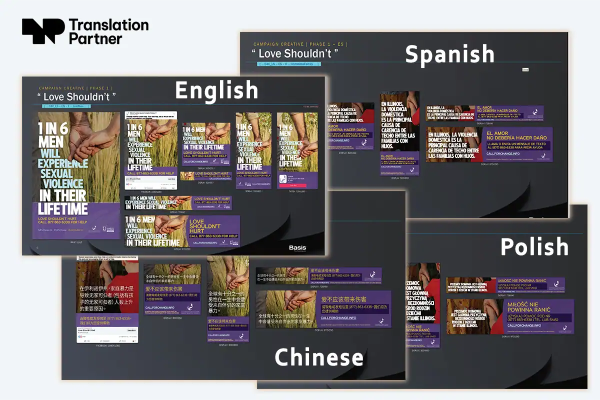
What does a multilingual DTP workflow include?
- File preparation and assessment
- Layout adaptation for each target language
- Typography and font management
- Cultural localization of visuals and design elements
- Quality assurance
- File output in the required formats
This process assumes you already have the translated or localized text ready.
What Types of Projects Require DTP?
Any document that combines text and layout and needs to survive translation intact is a candidate for multilingual DTP.
This includes marketing materials, technical manuals, legal documents, product packaging, annual reports, and any other file where design and content are inseparable.
The industries that rely on multilingual DTP the most are those where layout failures have costly consequences:
- E-commerce: Product catalogs are particularly vulnerable to text expansion. A few extra words in German or French can break an entire page grid across hundreds of stock-keeping units (SKUs), the individual product entries that make up a catalog.
- Software and SaaS: User interface (UI) strings and documentation need precise fitting. A button label that reads “Sign Up” in English may be significantly longer in another language. If the layout isn’t adapted, that button overflows its container, breaking the interface.
- FinTech: Compliance documents have strict formatting requirements. A misaligned table or truncated field isn’t a design problem; it’s a compliance risk.
- Healthcare: Patient-facing materials like medication guides, dosage instructions, and safety warnings require precise layout. If the document isn’t properly adapted after translation, critical information can be cut off, hidden, or presented out of sequence.
- Publishing and media: Design-heavy formats such as magazines, reports, and educational content rely on visual hierarchy. DTP preserves the reading experience across every language version.
Why Is Desktop Publishing a Critical Part of the Translation Process?
Translation isn’t a word-for-word process. Some words translate into two or three words in another language. Some concepts don’t exist in other languages or cultures at all and require workarounds.
A 20-word paragraph in English might become 30 or more words in Arabic, or significantly fewer in Japanese.
When content moves into a new language, the visual layer shifts with it.
German expands. Arabic runs right to left. Russian uses the Cyrillic script, which affects spacing and line breaks differently from Latin-based languages. Japanese requires an entirely different font system.
Without DTP, a perfectly translated file can still be completely unusable. Skip DTP, and translation delivers words. What it won’t deliver is a usable document.
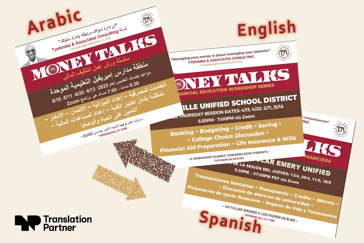
Three things DTP protects
- Layout integrity: Your text reflow, box sizing, column widths, and page grids are all built around the source language. Once you replace that text, every layout assumption needs to be re-evaluated for the target language.
- Direction switching: Moving between left-to-right (LTR) and right-to-left (RTL) scripts like Arabic isn’t a text setting you can toggle. It affects alignment, punctuation placement, image positioning, and the entire reading flow of the document.
- Brand consistency: A German brochure with a different font weight, slightly off-brand colors, or inconsistent logo placement doesn’t look like a translation. It looks like a different company. DTP ensures every language version holds to the same visual standard as the original.
Research shows 76% of online buyers prefer to purchase products with information in their own language. Getting them that content isn’t enough if the layout undermines their trust in it.
| Point of comparison | Translation only | Multilingual DTP |
| Deliverable | Translated text file | Publish-ready designed document |
| Layout | Unchanged from source | Adapted for each target language |
| Fonts | Source fonts retained | Language-appropriate fonts sourced and applied |
| Cultural design | Not addressed | Imagery, color, and layout were reviewed for each market |
| Brand consistency | Not guaranteed | Maintained across all language versions |
| Time to market | Faster initially, slower after rework | Predictable delivery, no redesign cycle |
| Cost | Lower upfront, higher total | Emergency redesign after translation typically costs 2–4x the original DTP fee and delays launch by one to three weeks. The upfront DTP investment pays back in the first rework cycle avoided. |
What does multilingual DTP look like in practice?
A company launches a new website in German using translation only. The copy is accurate. But text overflow breaks the hero section, navigation labels spill outside their containers, and the launch is delayed two weeks for emergency redesign.
With multilingual DTP alongside translation, the German site launches on the same day as the English version, correctly laid out from the start.
DTP vs. Graphic Design: What’s the Difference?
Graphic design creates visual concepts from scratch. It defines the look, feel, and identity of a document before you place any text.
DTP comes after that. It takes a finished design and prepares it for production, reproduction, and distribution, particularly across multiple languages.
Where graphic design asks, “What should this look like?” DTP asks, “How do we make this work in every market we’re publishing in?”
Typesetting sits inside DTP as the text-specific layer, covering how text is arranged on the page, including spacing, line breaks, and glyph rendering. Typesetting is one component of DTP, not a synonym for it.
If your designer hands you a finished file and you need it in six languages, that’s a DTP job, not a design brief.

What File Formats Work Best for Multilingual Desktop Publishing?
The format you hand off to your DTP team determines how much work is possible and how quickly it can be done.
Some formats give your team everything they need. Others create problems before the project even starts.
Adobe InDesign (IDML/INDD)
InDesign is the industry standard for multilingual DTP, and for good reason. It supports complex scripts, RTL text direction, and a wide range of fonts and character sets.
The IDML format helps multilingual workflows because it’s version-independent, meaning your DTP team can open it regardless of which version of InDesign they’re running.
If you’re producing any layout-heavy document destined for multiple languages, InDesign is the right tool.
Microsoft Word (DOCX)
Microsoft Word is acceptable for simpler documents like reports, contracts, and internal communications. It handles basic multilingual formatting reasonably well for Latin-based languages.
Where it falls short is with complex layouts, RTL scripts, and Chinese, Japanese, and Korean (CJK) languages, where spacing, line breaks, and character rendering become harder to control precisely.
Flattened PDFs
A flattened PDF is not a source file. It’s an output. There’s no live text to extract, no layers to work with, and no way to make layout adjustments without rebuilding the document from scratch.
Sending a flattened PDF to your DTP team doesn’t give them a file to work with. It gives them a reference image.
The practical rule: Always share editable source files. Whatever software produced your document, your DTP team needs the original working file, not an exported version of it.
How to Handle Fonts in Multilingual & RTL Documents
Despite being one of the most common points of failure in multilingual DTP projects, font problems are one of the easiest to prevent. All you need is the right preparation.
Font embedding vs. outlining
Embedding preserves live, editable text inside the file. It’s the right choice for any document that will go through a DTP workflow, because your team needs to access, edit, and reflow that text.
Outlining converts text to vector shapes, which locks the characters permanently. Use outlining only for final output files where no further editing is needed, never for source files heading into a multilingual workflow.
RTL scripts: Arabic and Hebrew
Arabic and Hebrew require fonts with full Unicode support and correct OpenType features for script shaping.
Not every font that claims Arabic support actually renders it correctly.
A font needs to support ligatures, contextual alternates, and right-to-left text direction natively. For Arabic typesetting, fonts like Noto Naskh Arabic and Adobe Arabic are reliable choices that render accurately.
CJK languages and fonts
Chinese, Japanese, and Korean fonts are significantly larger in file size than Latin fonts because they contain thousands of characters.
Licensing is also something to consider. Many CJK fonts are commercially licensed and cannot be freely embedded or distributed. Always confirm licensing before including a CJK font in a document destined for client delivery or print production.

What does font failure look like in practice?
A design team builds a brochure using a clean English display font. Something like Futura or Helvetica. The file looks sharp in the source environment.
The file goes to a DTP specialist for Arabic layout. That display font has no Arabic glyph set and no RTL shaping rules. InDesign doesn’t flag an error. It quietly substitutes a system default instead.
The result is a document with two completely different typefaces. The English headlines stay on-brand. The Arabic body copy renders in something the brand has never approved and doesn’t recognize. The layout the client signed off on no longer exists.
But you can easily avoid this.
Before handing off any source file, package your fonts. Every font used in the document should travel with the file, not stay behind on your local machine.
What Makes Arabic and RTL Desktop Publishing Different?
Arabic is one of the most technically demanding scripts in multilingual DTP, and the area where generic layout tools most frequently fail.
Understanding what makes RTL documents different helps you brief your DTP team more accurately and catch problems before they reach the layout stage.
It’s not just text direction
RTL does not simply mean text flows right to left. The entire reading logic of the document reverses. Tables read right to left. In a two-column layout, the primary column sits on the right. Bullet markers appear on the right margin.
Page numbers in Arabic documents run in the opposite direction from the English version. This is a structural design decision, not a text setting.
Bidirectional text requires explicit handling
Documents with Arabic body text, English product names, and numeric pricing in the same paragraph are common in business and e-commerce contexts.
This mixed-direction content requires explicit Unicode bidirectional (BiDi) control to render correctly. Without it, numbers and Latin brand names appear in the wrong position within Arabic paragraphs.
InDesign handles BiDi through its Paragraph Composer settings, but it requires a specialist who knows where to look.
Kashida & numeral systems
Arabic typography uses Kashida, a horizontal stroke extension between letters, for text justification. Most word processors ignore it entirely. InDesign handles it natively, but only when the correct paragraph settings are applied.
Arabic documents may also require Eastern Arabic numerals (٠١٢٣) rather than Western Arabic numerals (0123), depending on market and document type. GCC business documents often mix both. This is a layout decision with brand and compliance implications.
Images and layout direction
In Arabic layouts, directional visuals, a person facing a direction, an arrow pointing, and a process flow diagram are typically mirrored. The reader’s eye enters from the right, and directional elements should follow that orientation. This is a cultural adaptation choice that affects the entire document’s visual logic.
Text Expansion and Contraction: What Every Designer Should Know
In practice, a translated text will rarely take up the same space as the original. Often it will go under or over.
German expands. A short English phrase can become a significantly longer compound word. French and Spanish usually run 15% to 25% longer than English.
Russian often expands too, particularly in formal or technical registers. CJK languages often contract, fitting more meaning into fewer characters.
This creates problems when the translation is part of a design. These problems need to be solved at the design stage, not after the translated copy lands in your layout.
How does text expansion affect document layout?
Fixed-width containers are the first casualty. A text box sized precisely around an English copy will overflow in German and leave awkward gaps in Japanese.
Navigation labels, button text, pull quotes, captions, and any other constrained text elements are vulnerable.
White space is the second. Designs built with tight margins and minimal breathing room have nowhere to absorb expansion. The layout either breaks or gets compressed to the point of being unreadable.
The rule? Build in a 30% buffer in every text box when designing source files intended for translation. It costs nothing at the design stage and saves significant rework later.
What is an example of DTP in a multilingual project?
A software company translates its UI into Japanese. The English button reads “Sign Up Here,” three words that fit cleanly in the container. The Japanese equivalent is longer when rendered, and without layout adjustment, the button text overflows or gets cut off entirely.
With DTP, the layout is adapted, the button resizes, and the interface stays functional.
Now multiply that across a 50-page product catalog going into German, Japanese, Arabic, and Chinese simultaneously.
Each language expands or contracts differently. Arabic flips the entire layout direction. CJK languages require different font sourcing. Every language version needs its own layout adjustments and QA passes.
This is why text expansion is a structural consideration that belongs in your design brief from day one.
Multilingual DTP: Layers, Styles, and Document Structure
How you build your source file determines how smoothly it moves through a multilingual DTP workflow.
A well-structured document saves time at every stage. A poorly structured one creates problems that compound across every language version.
Separate text and image layers
Text and images should always live on separate layers. Never flatten them together.
When layers are merged, your DTP team can’t isolate and edit the text independently. For a document going into five languages, that’s five manual rebuilds instead of five clean text swaps.
Never rasterize text for the same reason. Rasterizing converts text into a flat image, which means it can’t be extracted, edited, or reflowed.
Use consistent paragraph and character styles
Ad hoc formatting throughout your document, manually bolded words, locally adjusted font sizes, and inconsistent spacing mean your DTP team has to chase down every instance across every language version. Styles applied consistently mean the formatting travels with the text.
Link images, don’t embed them
Embedded images inflate file size and make updates harder to manage.
On the other hand, linked images keep files lighter and easier to handle across multilingual versions. Always include your linked image folder when packaging source files for handoff.
Set up master pages early
Master pages keep layout consistent across every page, so every language version starts from the same structural baseline.
Set them up before you begin laying out content, not after.
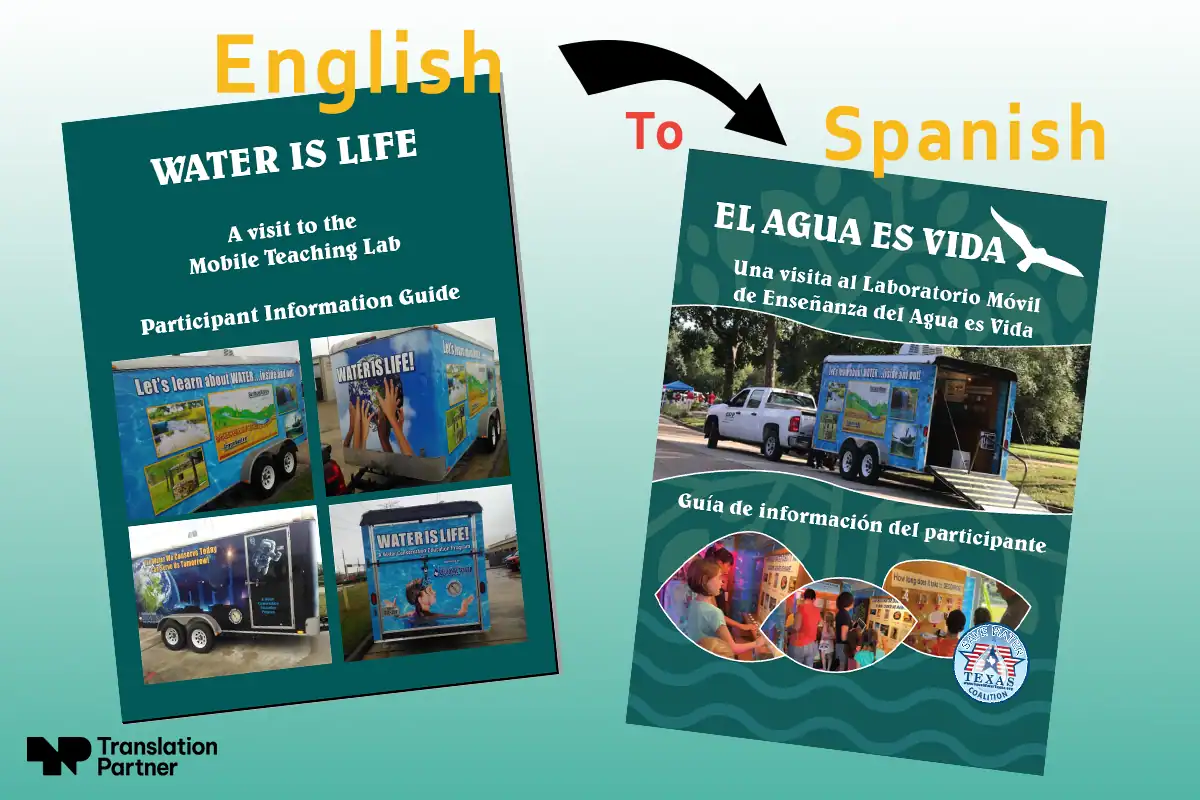
What Are the Most Common DTP Mistakes in Translation Projects?
Almost all DTP problems originate in the source file, not the translation.
Luckily, they’re easy to fix.
Here’s what to watch for before your next multilingual DTP project. If not caught early, each of these mistakes will cost you time and money.
- Submitting flattened PDFs: A flattened PDF is an output file, not a working file. Your DTP team can’t edit it, extract text from it, or adapt the layout. Always send editable source files.
- Missing or non-embedded fonts: If your fonts don’t travel with the file, the DTP team works with substitutes. The layout shifts and your brand suffers.
- Hardcoded text inside images: Text baked into an image can’t be translated or reflowed. It has to be rebuilt from scratch in every language version.
- Design software without Unicode or RTL support: Not every design tool handles Arabic, Hebrew, or CJK scripts correctly. Make sure your DTP software or DTP service provider supports the languages in your project before work begins.
- No buffer space for text expansion: Tight text boxes sized around English copy will break in German, French, or Russian. Build in a 30% buffer at the design stage.
- Culturally insensitive design choices: Colors, imagery, and symbols carry different meanings across markets. A design that works in one region can create confusion or offense in another.
- No brand consistency across languages: Logo size, color values, and font choices that vary between editions signal a lack of quality control. Every language version should hold to the same visual standard.
When to Bring in DTP: Before Translation, Not After
Most teams bring in a DTP specialist after the translated copy is delivered. By then, the layout has already been built around source language assumptions.
Text boxes are sized for English. Fonts haven’t been checked against the target language. Images with hardcoded text are locked and can’t be reflowed.
Fixing these problems after translation is expensive. Fixing them before costs almost nothing.
A DTP file assessment at the briefing stage, before translation begins, identifies expansion risks, flags fonts that won’t support the target script, and catches hardcoded image text while it can still be rebuilt cleanly.
This is how professional multilingual DTP workflows are structured. The earlier your DTP team sees the source files, the fewer surprises you’ll encounter when the translated copy arrives.
How to Work with a Multilingual DTP Team or Provider
The handoff is where most projects either run smoothly or fall apart. What you send and how you send it directly affect the quality and speed of the work on the other side.
What to send your DTP team or service provider:
- Your editable source files, not exported PDFs
- All fonts packaged with the document
- Your brand guidelines, including logo usage rules, color values, and typography standards
- Any reference materials from previous language versions, if they exist
- A style guide, if your organization has one
The more context your DTP team has upfront, the fewer rounds of revision you’ll need later.
What to expect from a DTP provider
A professional multilingual DTP provider will start with a file assessment to identify potential issues before layout work begins.
From there, you can expect language-specific layout adjustments for each target language, proofing rounds to catch errors before final output, and delivery in the file formats your project requires.
If you’re working across several languages simultaneously, confirm early how the provider manages version control and QA across language versions. This saves significant back-and-forth later in the project.
At TranslationPartner, every multilingual DTP project begins with a file assessment against the target language list before translation begins, identifying font gaps, expansion risks, and hardcoded image text at a stage when fixing them costs nothing.
Frequently Asked Questions about Multilingual DTP & Typesetting
– What is meant by typesetting?
Typesetting is the process of arranging text on a page for print or digital output. It covers font selection, spacing, line breaks, and glyph rendering.
In a multilingual context, typesetting also involves ensuring that text renders correctly across different scripts and writing systems. Typesetting is not a synonym for DTP, but a component of it.
– What is the difference between formatting and typesetting?
Formatting applies basic text properties like font size, bold, and paragraph spacing, typically inside a word processor. Typesetting goes further, controlling the precise visual arrangement of text on a page, including kerning, leading, and script-specific rendering.
Formatting is a starting point, while typesetting is what turns a formatted document into a professionally laid-out one.
– What is an example of DTP?
Imagine wanting to translate a product catalog from English into German, Arabic, and Japanese. Each language version requires layout adjustments for text expansion, font changes to support the target script, and direction switching for Arabic. With DTP, the result is a publish-ready document in each language. Not just translated text dropped into the original layout.
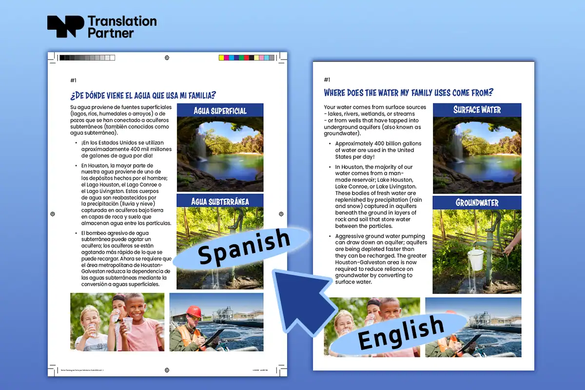
Getting Multilingual DTP Right Starts Before Translation Begins
The decisions that determine whether your multilingual documents succeed or fail happen at the source file stage, not after translation.
The file format you choose, how you structure your layers, whether you’ve built in buffer space, and how you package your fonts all shape what’s possible downstream.
If you’re preparing files for a multilingual project and want to make sure they’re DTP-ready before work begins, TranslationPartner’s team can help.
We handle multilingual DTP across a wide range of languages, scripts, and file formats, from Arabic and Hebrew to CJK languages and European markets.
Ready to prepare your files for multilingual publishing? Get a free file assessment.